Fact Finders Pro · Shipped 2026

Role
Product Designer
Team
1 PM, 4 Engineers, 1 Designer (that's me!)
Skills
Product Design, User Research, Information Architecture
THE CHALLENGE
When Pricing Becomes a Conversion Killer
When I joined the FFP redesign, the pattern was clear: Users were abandoning at the pricing page. Consistently.
The funnel showed a cliff at the decision point. Support tickets piled up with the same questions such as: "What am I actually paying?" "Is the $400/year the total cost?"
Investors were requesting refunds after purchasing the wrong plan. These weren't casual browsers they were sophisticated decision-makers who needed confidence before committing. The pricing page was destroying it.
This wasn't a visual problem. It was a structural information architecture failure.
Problem
A heuristic evaluation with the product team revealed not minor issues but a cascade of structural failures:
Billing cadence confusion. Five cards mixed WITH "/month" and "/year" formats as if they were equivalent metrics. But they weren't some plans were flat subscriptions, others were per-report. Users couldn't tell which plans were different models and which were billing variations of the same model.

The misleading $400/year headline. Per-report plans led with "$400/year" as if it were the product price. It wasn't, it was an optional annual fee that reduced the per-report rate. One support ticket read: "I thought I was paying $400/year total. Why am I being charged $1,350 per report? This feels like a bait-and-switch."

Buried commercial facts. How many reports you get, what each costs, what data source is used — all hidden inside feature lists as plain gray text, indistinguishable from "Email support."

Impossible comparison. Features stacked from the top of each card, meaning shared items landed at different vertical positions across cards. Horizontal scanning was impossible.

The Trust Deficit
In follow-up interviews with 12 investors who abandoned at pricing, 10 said they felt like they were "missing something." One institutional investor said: "When pricing is this hard to understand, I assume the company is hiding something. I moved on to a competitor."
The pricing page wasn't just failing to convert, it was actively damaging brand credibility.
process of rethinking pricing
1. Stakeholder Alignment : Discovering the True Pricing Model
Before fixing the UX, I needed to fix the business model clarity.
Alignment sessions revealed that the confusion on the page mirrored confusion internally. The $400/year wasn't a standalone plan, but it was a discount lever. When you opt in, the per-report cost drops from $1,350 to $1,200. But it was framed as a "$400/year plan," making it look like a cheaper alternative rather than a mechanism.
Stakeholders also wanted to introduce a new Budget plan mid-redesign, which means that the project required accommodating a new tier while making the entire system more comprehensible.
The Pivot: Reframing the Question
Instead of asking "How do we organize monthly vs yearly plans?" I asked: "What are the fundamentally different ways a user can pay?"
The answer:
1. Subscription plans (flat fee) vs
2. Pay-per-report plans (billed per use, with optional annual fee to reduce per-report rate).
That distinction of pricing model and not billing cadence, became the organizing principle. You can't design a clear pricing page if the pricing strategy itself is unclear.
2. The Solution: New Information Architecture

The Five Core Design Principles

Final Designs
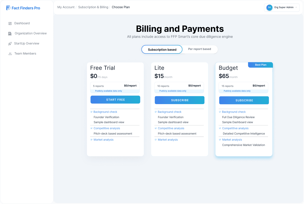

Validation
I tested the redesign with angel and institutional investors, the actual users, plus internal stakeholders. Task: "Choose the plan that best fits your needs and explain why."
Every participant identified their plan within seconds, could articulate the per-report cost, and understood the toggle without prompting. Several specifically called out the value box: "I can see exactly what I'm getting right at the top." One investor said: "The old page made me feel like there was a catch. This version makes me trust you're being straight."
Stakeholders fielding weekly refund requests saw immediately how the new structure preemptively answered the questions that had been generating tickets.
IMPACT
Launched six weeks after the initial heuristic evaluation. Within the first month:
70% reduction in pricing page drop-off
20% increase in overall conversion rate
50%+ reduction in pricing-related support tickets
Not marginal improvements — step-function changes directly impacting revenue.
KEY TAKEAWAYS
Pricing redesign is strategy work first, design work second. Stakeholder alignment — reframing the pricing structure around user mental models instead of internal billing logic — was the most critical phase. Design execution followed naturally.
IA clarity has measurable business impact. The 70% drop-off reduction didn't come from prettier buttons. It came from restructuring information so users could answer "What am I paying for?" without decoding anything.
Removing misleading framing builds trust more than adding features. The biggest wins came from what was removed — the false headline, the buried facts, the ambiguous logic — not what was added.
The mental model should drive the IA. The original page was organized around internal billing logic. The redesign was organized around the user's decision logic. That shift — inside-out to outside-in — was the difference between confusion and clarity.